Menu creator
The menu creator page is where the user can modify the content and shape of the main menu. It is divided into the display part, the menu design part, and the menu content part. The user can also access the advanced features section that can be accessed by the “advanced feature” toggle button for more optimization.
The menu itself consists of three levels
- Header : this serves as the elements that open the dropdown menu
- Group : the headers in the dropdown menu
- Subcategory: the elements under the group
Display section
The first part of the menu creator is the menu display. In this part the user can see what the menu looks like and what it will hold.

Under display there is an “Apply” button, which acts as the triggering element that saves the configurations of the menu.
Menu design
This is the part where the user can modify the color scheme of the menu. The input fields are:
- Menu Background Color
- Drop Menu Background Color
- Headers Text Color
- Groups Text Color
- Groups Hover Text Color
- Sub Category Text Color
- Sub Category Hover Text Color
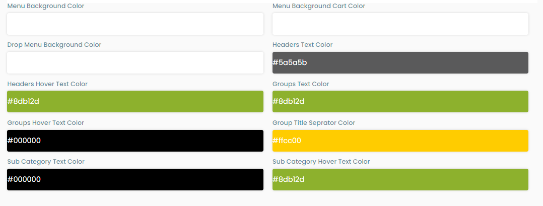
The user can easily manipulate the colors of the elements of the menu either by a color picker embedded in each input field or by entering the hexadecimal code of their preferred color.
Menu content
In this part, the user can manipulate the content of the menu itself. As discussed before the menu has three level architecture you can see this architecture and the elements inside it in the first part of the menu content
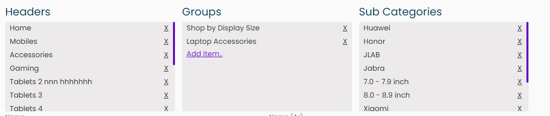
The user can add an item with the “Add item" button.
If the user chooses any of the elements in this widget a form appears under it to manipulate it. There are three types of forms:
- A header form
- A group form
- A subcategories from
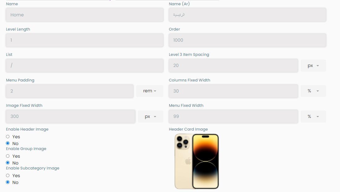
Header form
This form opens when pressing on a header in the menu content manipulator. This form has the following:
- Name
- Name (Ar)
- Level Length: the number of levels in this element
- Order: the sorting order in the menu
- List: the link that opens when pressing on the element
- Level 3 Item Spacing
- Menu Padding
- Columns Fixed Width
- Image Fixed Width
- Menu Fixed Width
- Enable Header Image: a yes and no radio buttons
- If yes an image upload button appears on the side for uploading an image for the header
- Enable group image: a yes and no radio buttons
- If yes an image upload button appears on the side for uploading an image for the group
- Enable subcategory image: a yes and no radio buttons
- If yes an image upload button appears on the side for uploading an image for the subcategory
- header card image: an image that appears in main menu above the header
- An add gallery button that enablesthe user to add images that appear at the bittom of the menu
Groups and subcategory form
When pressing on a group or a subcategory a form appears having the following input fields for the corresponding group/subcategory:
- Name in english and arabic
- Order
- List : the link that the item opens
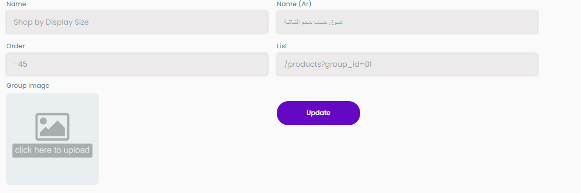
There is an update button in each form that can act as a triggering element to any changes in the menu configurations
Advanced features
This feature is activated when the user activates the advanced features toggle button that is under the menu content manipulator. This part consists of:
- The json editor: where the user can manipulate a json file containing the content of the menu
- “Generate from categories” button: adds the categories as headers and their groups and subcategories as such in the menu
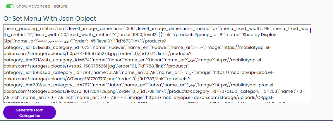
JSON files make it easier for users to manipulate the full structure of the menu in a one file format